The secret sauce of high-converting e-commerce: Information Architecture
Recently, I took part in a webinar where I was asked to talk about the importance of Information Architecture to E-commerce. In preparation for it, I put together my notes and decided to turn it into an article. If you prefer to watch the video, see below. If you prefer to read, please read on.
We’ve all left an online store in frustration, unable to find what we were looking for. We tried finding what we needed, maybe we used the search, but we lost hope of being able to find it on that site. This is a really common issue, and what's most frustrating for both store and user is that often the product was available in the catalogue. But poor Information Architecture (IA) was to blame, and it is the invisible culprit behind abandoned carts, lost revenue, and frustrated users.
IA is The Invisible Backbone of E-commerce
IA is the unsung hero of e-commerce. It's the framework that guides your customers from the homepage to the checkout. From navigation systems to search functionalities and categorisation, IA shapes the user experience and impacts the bottom line. But it’s not always easy to see a direct link between the two. And it's not easy to just ‘fix the IA’. So let's delve into the intricacies of IA, using real-world examples to illustrate what works and what doesn't.
In this article, we’ll unpack the three key ingredients to good IA:
- Navigation Systems
- Categorisation & labelling
- On-site Search
Navigation Systems: The Roadmap to Your Site
Navigation systems can take various forms. These include horizontal and vertical menus, mega menus, breadcrumbs, as well as footer and utility navigation. Filters and categories also play a key role. Each has its merits and pitfalls, which we'll explore through some examples.
The Double-Edged Sword of Mega Menus
Mega menus offer a quick overview of all available options, which can help users find what they need quickly, and also support discoverability. However, they can also overwhelm users with too many options. Overwhelm leads to cognitive overload [link], causing users to abandon the site in search of an easier, less stressful pathway.
Argos demonstrates this well with their navigation system. Whilst it’s useful to have all of these products available in one place, it can feel like a lot, especially when this is just one of several options in the vertical list of items.
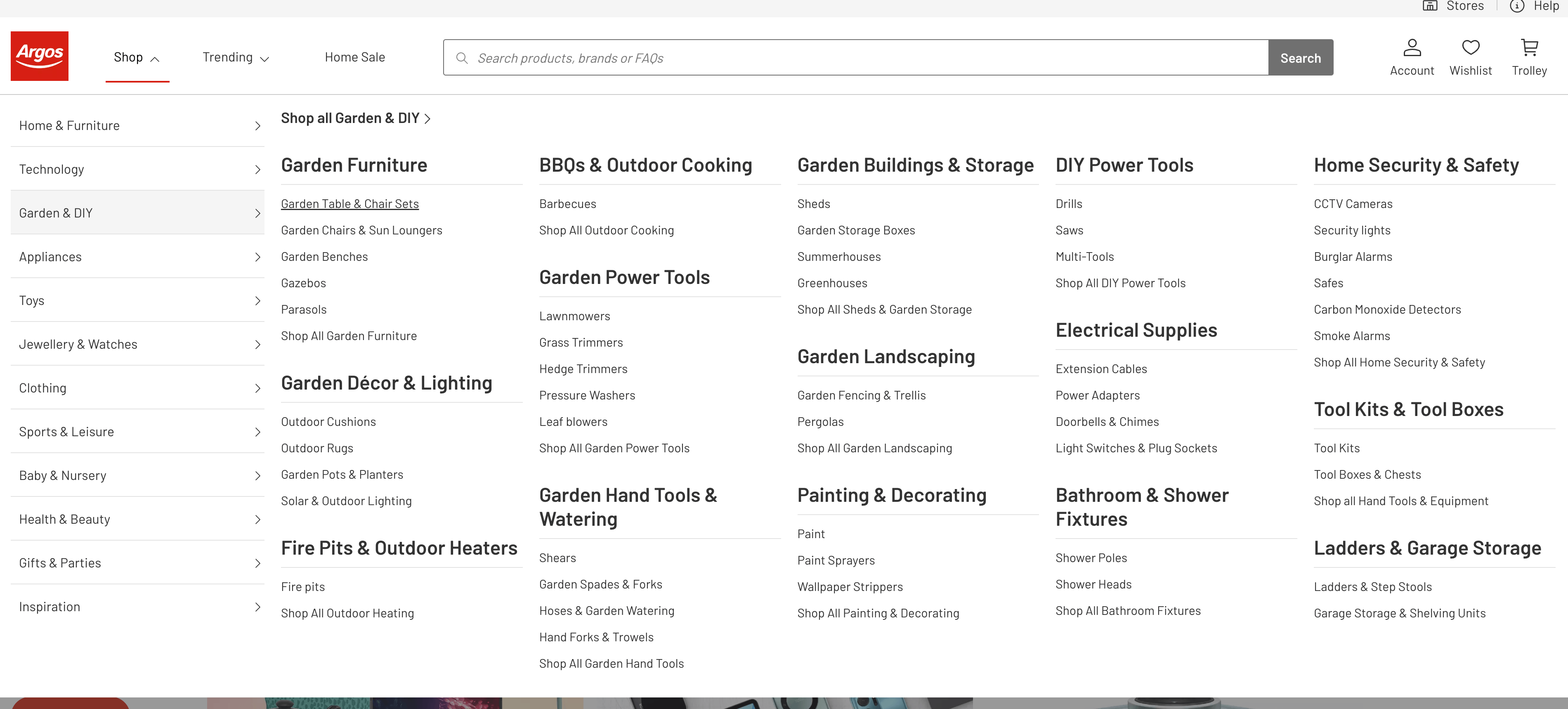
While the product categories are a really useful way to provide product groups, they are not clickable and therefore don’t allow for users who need an overview understanding of a product category before exploring further. Instead, they are forced to make a specific choice to explore a lower-level category first. This might be fine when the user understands what they are looking for, but not ideal when they are not confident in their purchase decision.
The Perils of Overstuffing Categories
Another common issue is stuffing too many items under just one category, with the other top-level categories feeling unbalanced.
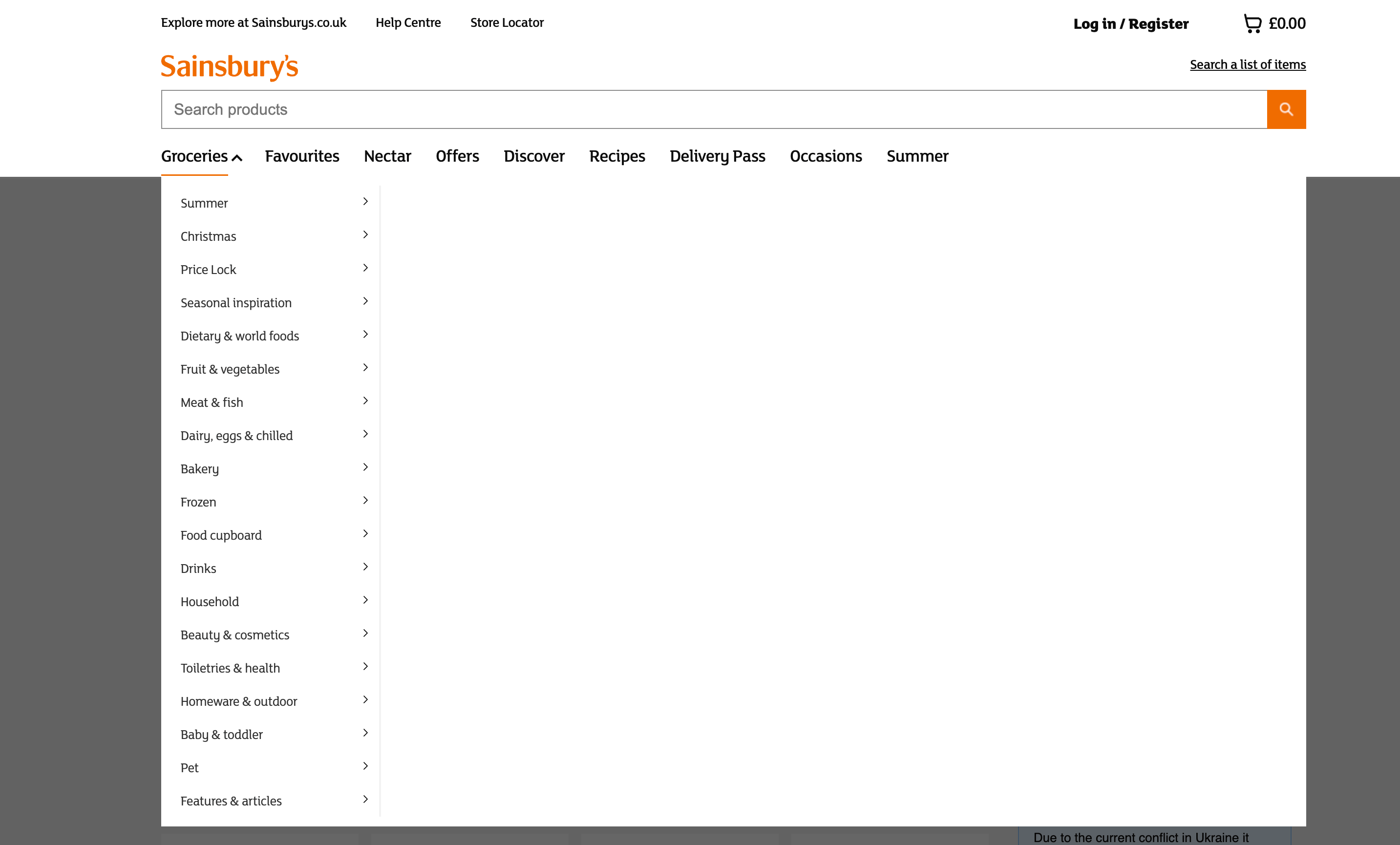
Take Sainsbury's as an example; they cram too many items under the ‘Groceries’ category. This leads to user frustration at having to scroll through long lists of products.
The Importance of Order and Predictability
Boots have a similar structure where all their products live under a disorganised list of ‘shop by department’, making navigation a chore. The problem worsens when users click on an item. They are then presented with long, incoherent lists of new navigation options.


Interestingly, they've attempted to patch this with a new homepage feature, but it's akin to putting a plaster on a wound that needs stitches when the real issue is a poor navigation system.
Best Practices in Navigation
ASOS and IKEA serve as excellent examples of good navigation systems.

ASOS uses a well-structured mega menu with visual cues. It doesn’t feel overwhelming and provides all the items someone would need to navigate the product category. Also notice that dresses are actually a third layer of navigation, where users have already chosen between gender and selected dresses.
One other aspect we particularly liked is their use of images to assist with recognition rather than recall - a common UX guideline. Essentially, we are all better at recognising something with a visual reminder as opposed to having to recall the name of a category from memory.
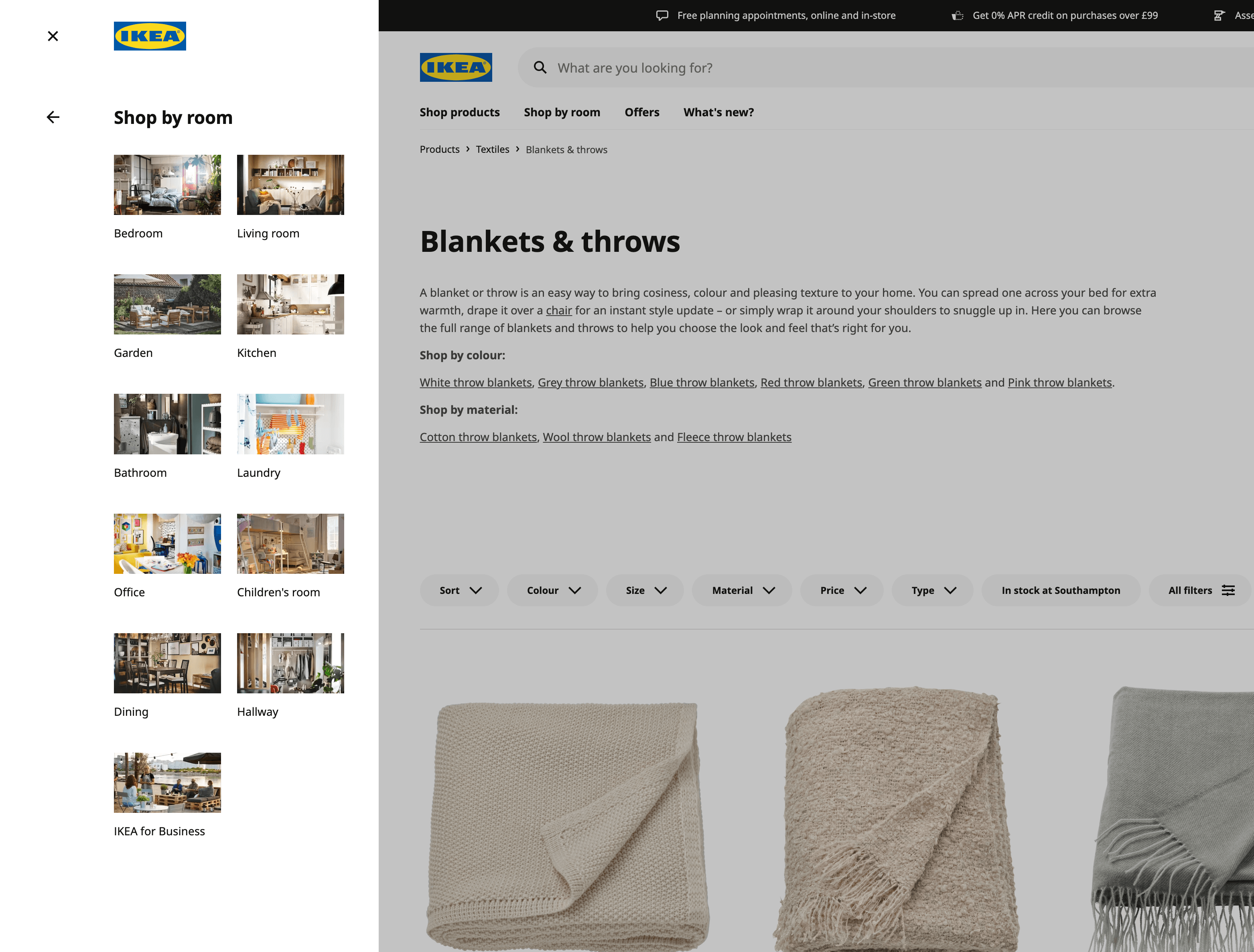
IKEA employs vertical left navigation with easily recognisable room types, making navigation feel effortless.
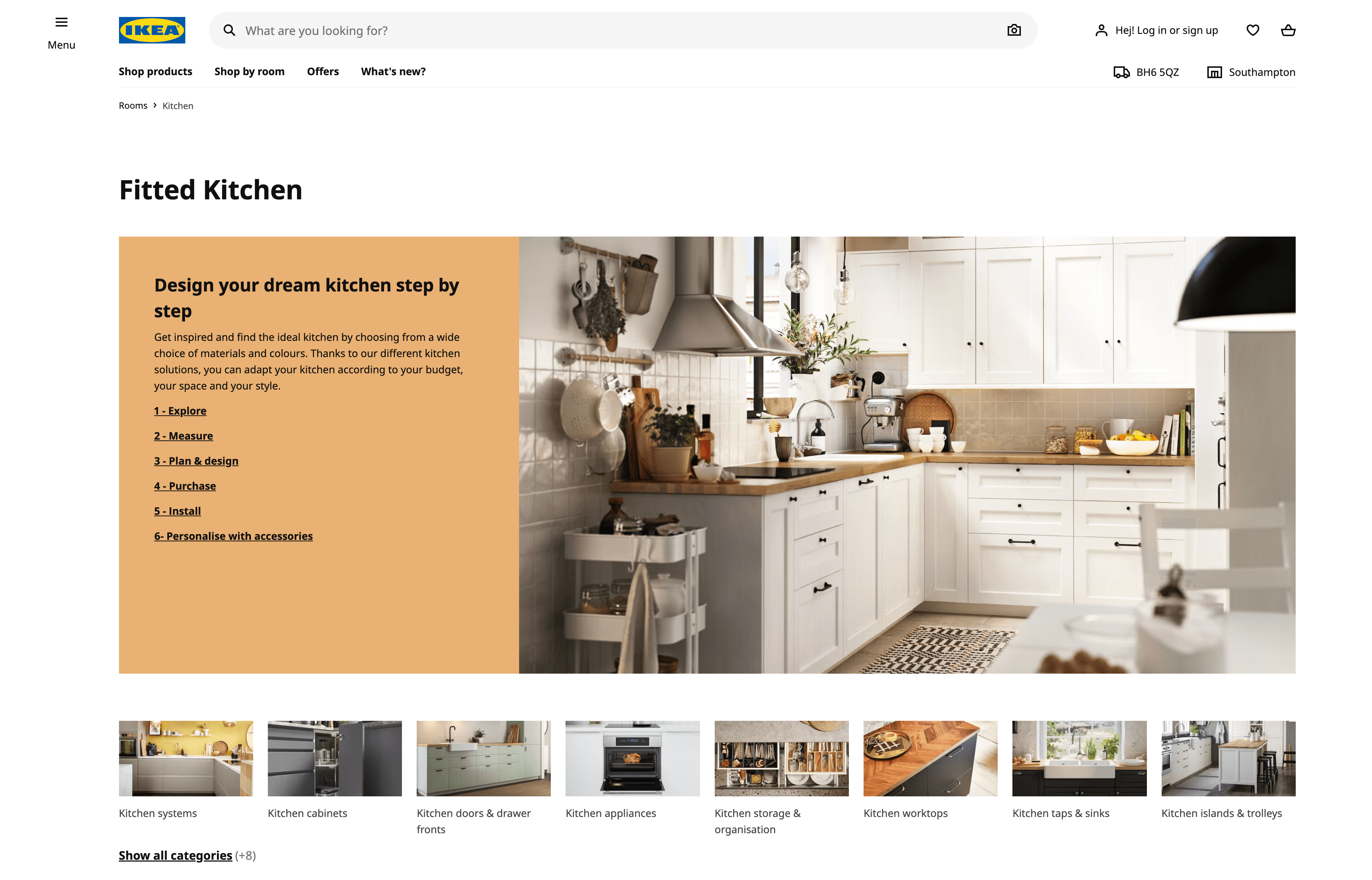
As you progress through the navigation by room, you are also presented with a list of links related to the stage you are at with your kitchen, from planning to implementation. Also, below that is another horizontal navigation listing more visual choices within the kitchen section. This is a highly effective and well-presented navigation system that’s really easy to use.
Navigation - UX Recommendations
So what can we learn from these examples? What should we do to create an easy-to-use navigation system? Here are some simple recommendations to follow:
- Ensure top categories are key product groups.
- Provide breadcrumbs for orientation.
- Make top-level categories clickable.
- Avoid overwhelming users with too many options.
- Fine-tune hover delay for optimal user experience.
Search Systems: The Safety Net
We’ve conducted many hours of research with users looking for products to buy online. What we see is that most people rely on navigation first and then revert to search as a backup when navigation fails to deliver. So the good news is that search is a way to help users find the products they need before they abandon. The bad news is that However, e-commerce sites fall short, unable to meet the high expectations set by Google.
Common Pitfalls in Search
A really common problem with site search is when the search term results in a dead end. When a search returns no results, it can lead to users leaving the site now that their last resort lets them down.
A common example of this is requiring people to provide an exact spelling of the search term. When they don't, this often leads to zero search results.
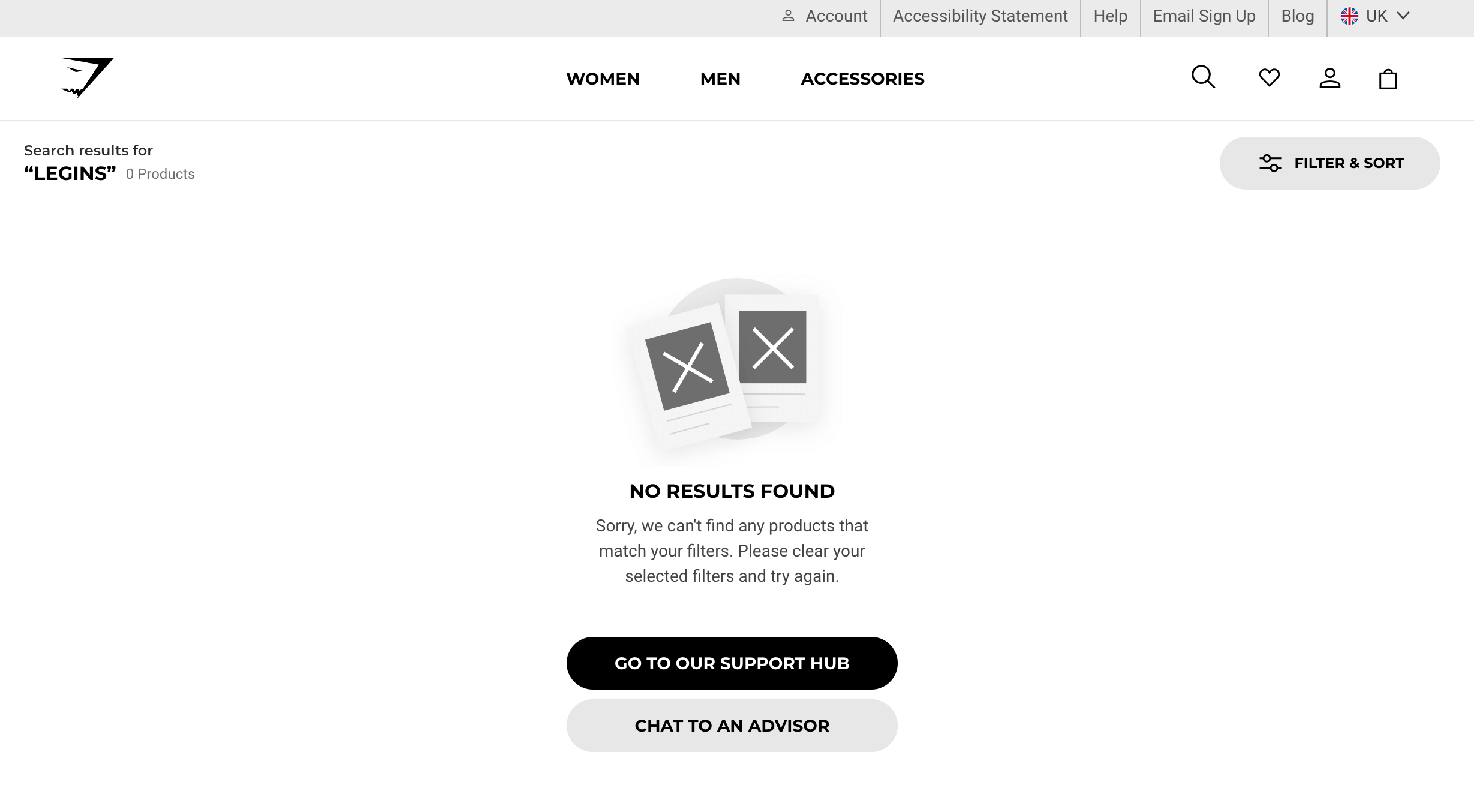
Gymshark's search feature requires exact spelling, leading to dead ends if users make errors.
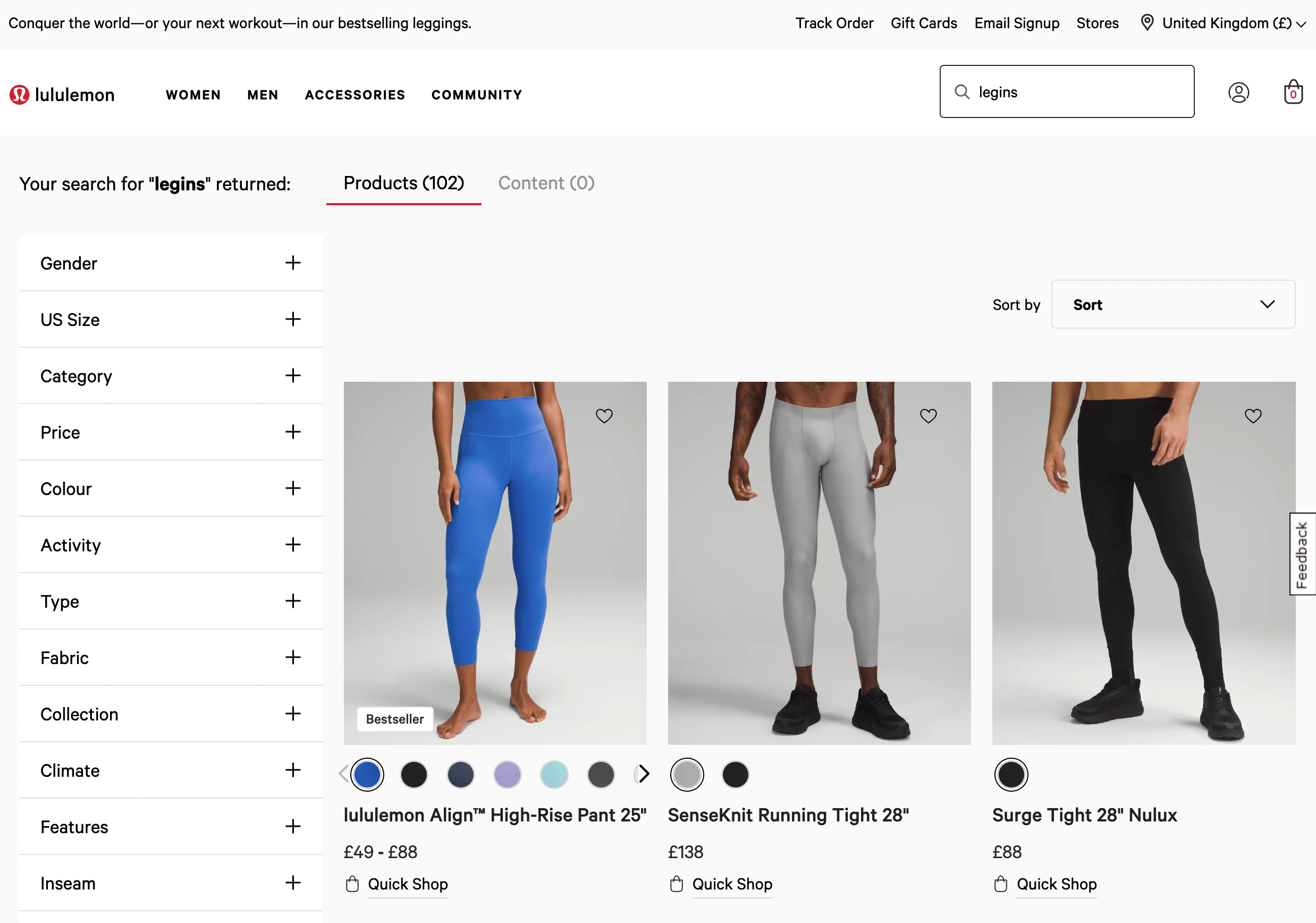
In contrast, Lululemon anticipates poor spellings and provides suggestions anyway. This is a great example of doing the hard work so users don’t have to.
The counter to this approach is to simply provide autocomplete suggestions, where Nike provide an excellent example. With suggested categories and searches alongside visual examples of products as users type.

The trouble with autocomplete is that it relies on users looking at the screen as they type. Yet a large percentage of people look down at the keyboard as they type. So autocomplete doesn’t get them out of the issue of misspellings.
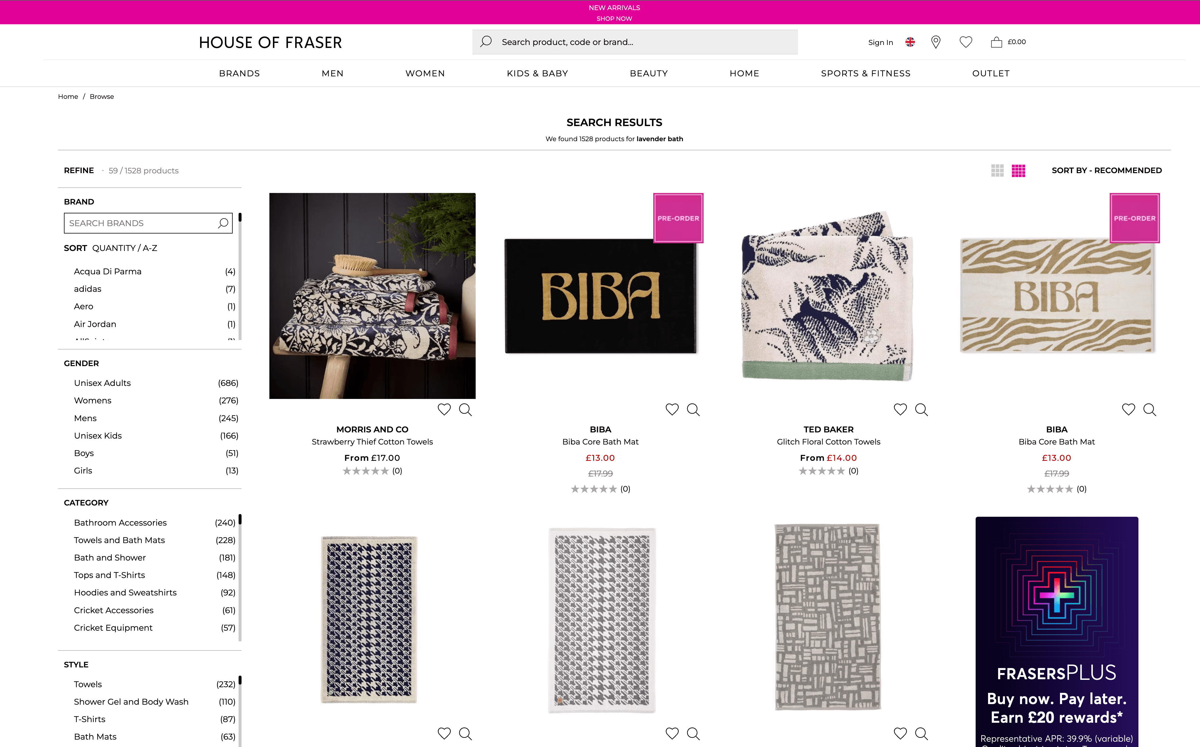
The biggest issue most users experience with search is a lack of relevance in the search results. In this example, House of Fraser's search system lacks relevance, displaying over 1500 unrelated products to the search term ‘Lavender Bath’. Despite a Lavender bath salts product being in stock and available on the site. Optimising search results so users can find what they are looking for is critical to the success of an e-commerce site.
Search - UX Recommendations
- Avoid dead ends and 'no results' pages.
- Anticipate and support spelling errors.
- Include filters in search results.
- Implement predictive search and autocomplete.
- Optimise the relevance of search results.
Categorisation and Labelling: The Invisible UX
Good information architecture is the invisible but essential component to good UX. At its heart, IA determines how products are categorised, labelled, and structured. Let’s look at some examples of why this can be so important.
Confusing Categories
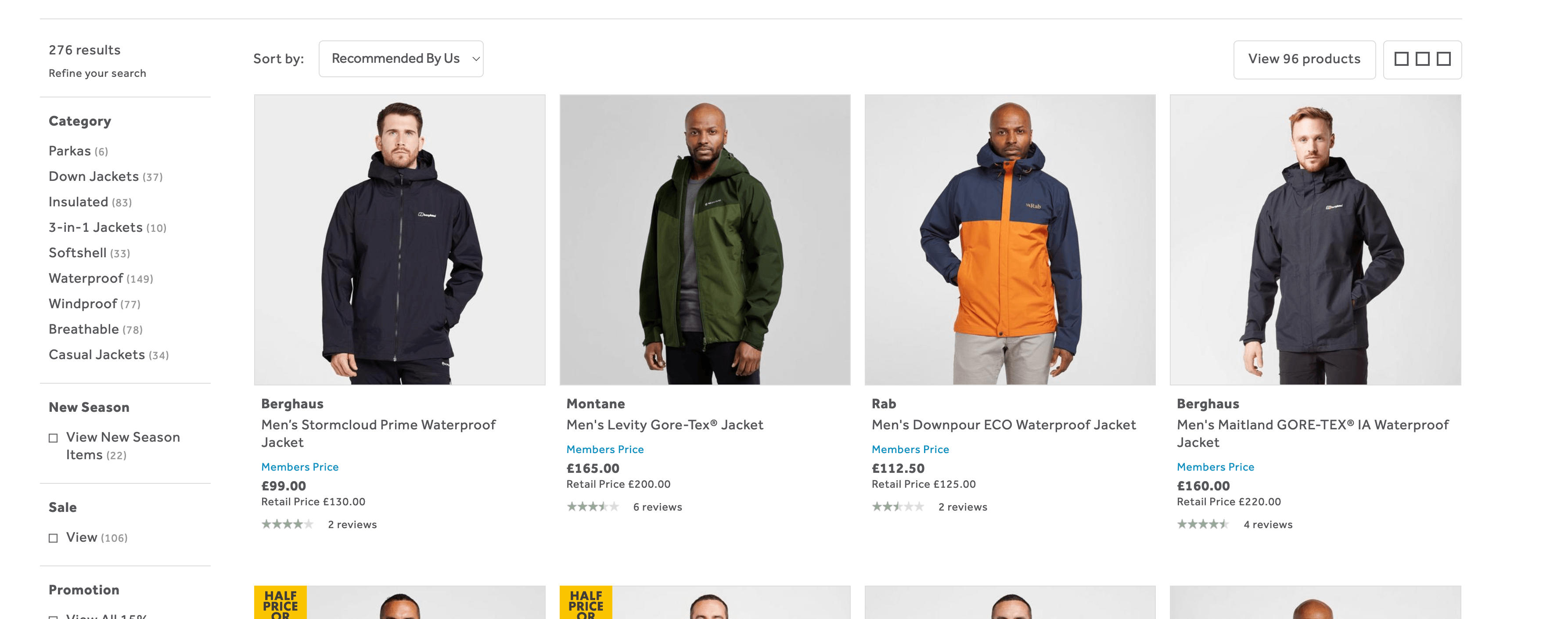
Go Outdoors uses categories for their products which means items must exist only in one category, despite them possibly belonging to multiple categories. This system forces users to already know the differences between categories, which may not always be the case. For example, for the typical user, the difference between Jackets that are 'Down' vs. 'Insulated' may be unclear. In addition, if a customer wants a ‘Waterproof’ and ‘Windproof’ jacket, they are out of luck with this categorisation system.


Other examples that may confuse users are John Lewis, where they place mattresses under 'Furniture and Lights', which may not be intuitive for all users when ‘bedding’ lives under ‘Home and Garden’. A strategy they could employ here would be to cross-reference related items to save users from having to explore all possible options.
Product Labels that lead to more questions

Burberry's bag categories are confusing and could benefit from clearer labelling. Most users will struggle with the labels provided.
Categorisation and Labelling - UX Recommendations
- Use labels that make sense to users.
- Avoid shared categories for multiple products.
- Test your IA with users and refine it accordingly.
- Ensure products are tagged and labelled correctly.
- Use cross-linking strategically.
Good IA leads to better store performance
Imagine an online store where users can effortlessly find what they're looking for, leading to increased sales, reduced cart abandonment, and a more loyal customer base. That's the power of good IA. It not only improves user experience but also gives you a tangible ROI that you can reinvest back into your business.
Conclusion - IA is essential to your bottom line
Ignoring the architecture of your online store is not an option; it's critical to your business. By focusing on effective navigation, search systems, and categorisation, you can significantly improve user experience and, by extension, your bottom line.